This report shows you the key parameters of your customers base, the dynamics of its growth, distribution of your customers by various parameters and provides a brief overview of your customers' opinion.
New Users
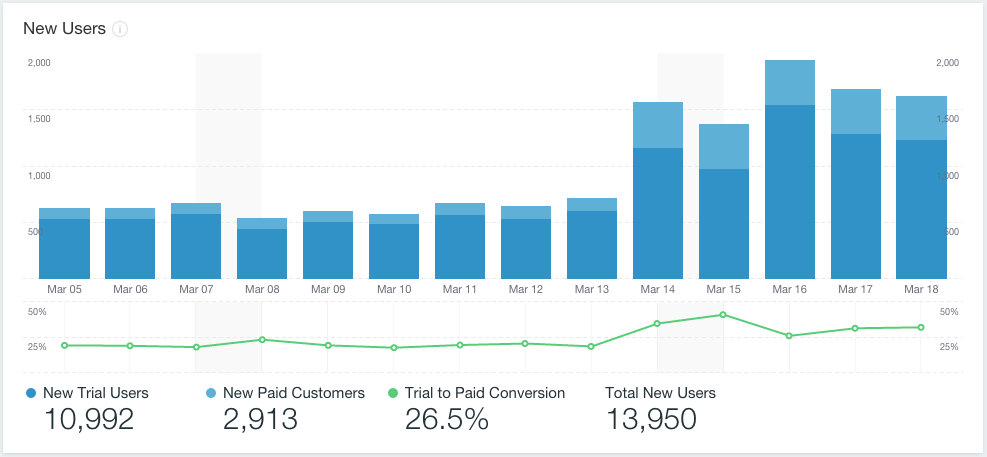
The first graph of the report displays the day-by-day number of new customers. Each bar on this bar chart shows the number of new trial and new paid customers on each day of selected period. To view numeric values, hover your mouse over the graph.
The second part of the graph shows the conversion ratio dynamics between trial and paid customers (in percent). Each point on graph shows you the percent for the day.
The numbers under the graph shows you the numbers of:
- new trial customers
- new paid customers
- trial to paid conversion ratio
- the total number of new customers.
Users by OS Version
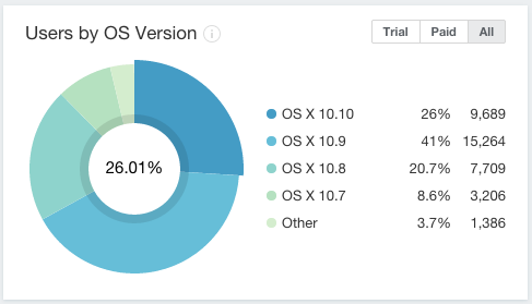
This pie chart displays the distribution of customers by OS version they use.
You can switch between trial, paid and all customers using the selector at top right corner of the widget.
Users by App Version
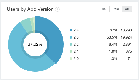
This pie chart displays the distribution of customers by app version they use.
You can switch between trial, paid and all customers using the selector at top right corner of the widget.
Users by OS Locale
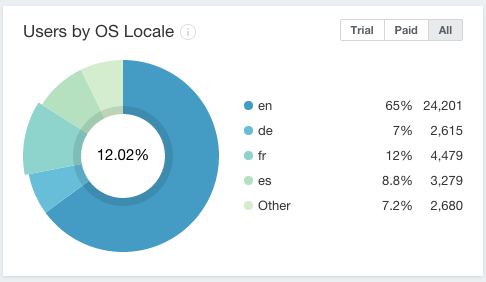
This pie chart displays the distribution of customers by OS locale they use.
You can switch between trial, paid and all customers using the selector at top right corner of the widget.
Users by App Locale
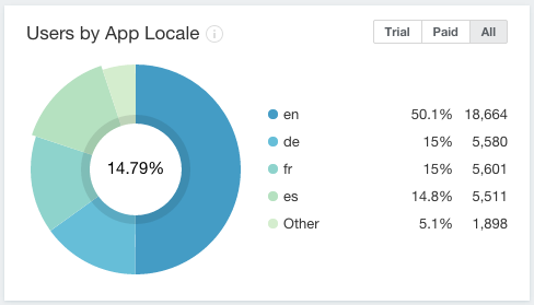
This pie chart displays the distribution of customers by OS version they use.
You can switch between trial, paid and all customers using the selector at top right corner of the widget.
Feedback
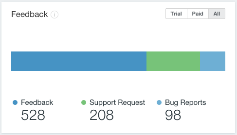
This widget shows the number of feedback messages received within the period by categories:
- Bug reports
- Support requests
- Feedbacks
You can switch between trial, paid and all customers using the selector at top right corner of the widget.
Launches per User
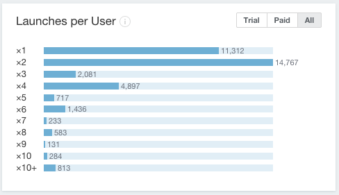
This bar chart shows the distribution of your customers by the number of times they've launched application.
Each bar shows the number of application launches per customer, and the bar length corresponds to the number of customers, who launched app exactly so many times.
You can switch between trial, paid and all customers using the selector at top right corner of the widget.
Usage Frequency
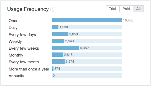
The widget shows the number of users distributed by the average frequency of software launches. This parameter is calculated as relation of days when customer did launch an application to the number of days between the first and the last launch.
The widget shows the number of users distributed by the average frequency of software launches. This parameter is calculated as relation of days when customer did launch an application to the number of days between the first and the last launch.
You can switch between trial, paid and all customers using the selector at top right corner of the widget.
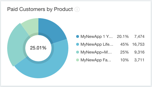
Paid Customers by Product
This pie chart displays the distribution of customers by the product variations they use.
Users by Hardware
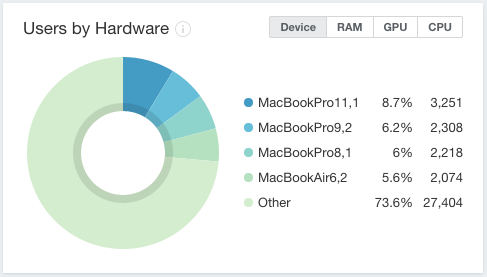
This pie chart displays the distribution of customers by the following hardware components:
- device
- RAM
- CPU
- GPU,
that can be switched with the selector at the top-right corner.
You can switch between trial, paid and all customers using the selector at top right corner of the widget.
